🧮 🦠 Data Corner: One Year of Covid-19
Help us build our Covid-19 dataset spreadsheet
Hello folks, Daniel here. Today I’d like to start by introducing you to our newest contributor, Mirela Petkova! Mirela is a freelance researcher and journalist based in Sofia, Bulgaria, and also a data visualization specialist at Energy Monitor. Her work focuses on investment and the environment in China and Europe, and she’s an alumna of the University of Groningen in the Netherlands. Welcome Mirela! 👏
Mirela will be driving Data Corner, including writing monthly roundups of all the datasets we find. The first of those is today, where the focus will be on the roughly-one-year-anniversary of Covid-19. We’ve gathered 40 datasets related to the virus, which you can view below, and will be adding more in the days, weeks and months ahead. If you see a dataset we’ve missed, please reply to this email and we’ll add it on there, including a cheeky hat tip. 👒
Before I handover to Mirela, I mentioned in Monday’s job board update that an anonymous subscriber paid for five annual subscriptions, and I’ve thrown in another five for good measure. That means we have 10 free annual subscriptions to give away, so if you or someone you know is in need of a job or internship, reply to this email and we’ll give them away toward the end of the week.
Okay, Job Corner update below, take it away Mirela!
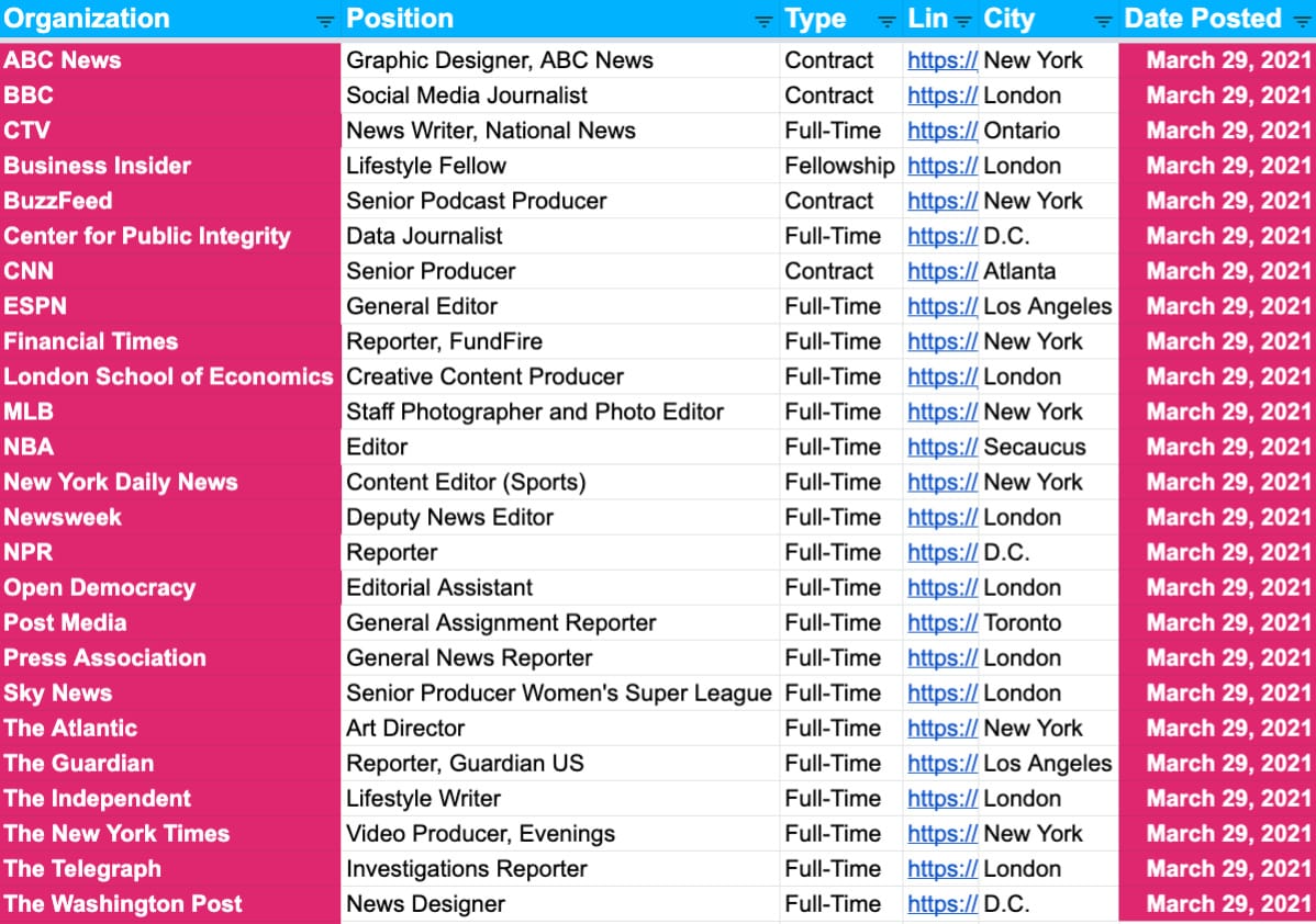
Job Corner ✍️
Below is a preview of the 375 new postings including at the likes of ABC News, the BBC, Business Insider, ESPN, the Financial Times, MLB, NBA, NPR, Sky News, The Atlantic, The Guardian, The Independent, The New York Times and The Washington Post…
If you’re a paying member, your jobs sheet link will remain the same. If you’re interested in a free trial, reply to this email and we’ll hook you up!
Data Corner: One Year of Covid-19 🧮 🦠
Hello everyone, Mirela here. This month marks a year into the pandemic for many people around the world. It’s incredibly difficult to take anything positive from all the distress and hardship we’ve all suffered, and we absolutely do not want to gloss over such grief lightly.
Due to the magnitude and global impact of Covid-19, one of the very few signs of hope has been the role of data. Whether it’s governments making crucial policy decisions, journalists translating and communicating those policies, or Joe and Karen deciding how to keep their kids safe, numbers and charts have become central to our daily lives.
Today we’re going to feature a few of the most insightful datasets and visualizations we’ve found, and as Daniel previously mentioned, you can access for free all of the datasets we’ve gathered so far by clicking the button below.
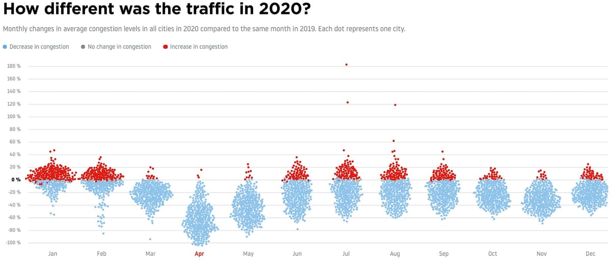
Covid’s Traffic Impact
At one point, approximately four billion people were under lockdown in one form or another to slow the spread of the virus. Data from TomTom’s Traffic Index shows us just how much those lockdowns and restrictions changed the volume of traffic around the world, by country, city and congestion level. As well as the excellent data, TomTom also put together some spectacular graphics to help us understand the data better, of which our favorite is below.

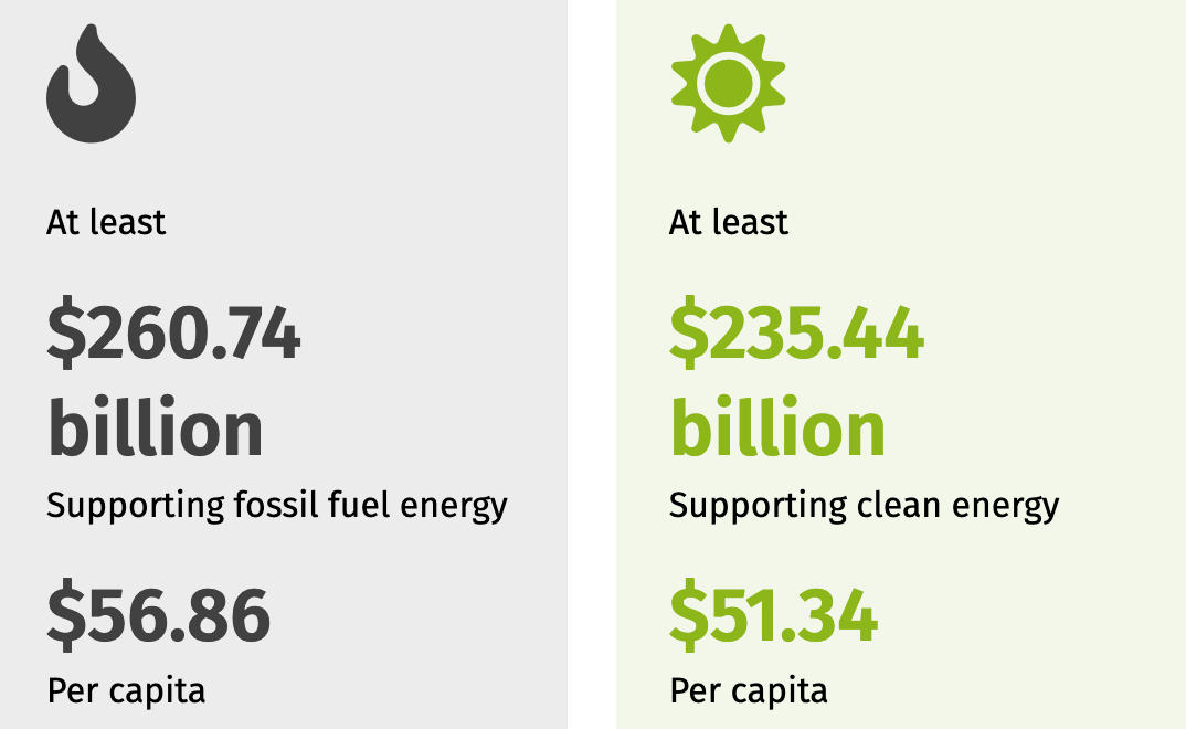
Green Energy Left Behind
While carbon emissions plummeted in the initial months of the pandemic, the climate emergency’s long-term future once again looks perilous. Governments around the world pledged to use Covid-19 as an opportunity to rebuild their economies sustainably by investing in green energy, but the evidence so far points to ‘business as usual’: 40 percent of all public funds is being invested in fossil fuel-intensive sectors, according to data from Energy Policy Tracker. The below infographic shows how G20 Countries have failed to put their money where their mouths are.
School Closures
In many countries, the majority of the workforce continue to work from home, putting untold stress on parents who have the added pressure of making sure their young children and teenagers don’t miss out on essential schooling. In fact, at the end of March last year, 84 percent of the world’s students were confined to studying at home. One of the impacts of such large numbers being away from school has been the lack of meals for vulnerable and disadvantaged communities. Thanks to the World Food Programme, we’re able to track just how many people are missing out on vital school meals.

Domestic Violence
For a significant number of people, childcare and work-related stress haven’t been the biggest issue from spending increased time at home. Across the globe, domestic violence mostly against women has become a pandemic within a pandemic. While the data isn’t as up-to-date as we’d like, the number of domestic abuse offences in the UK soared well above previous years during the first lockdown last spring, according to the Office of National Statistics.

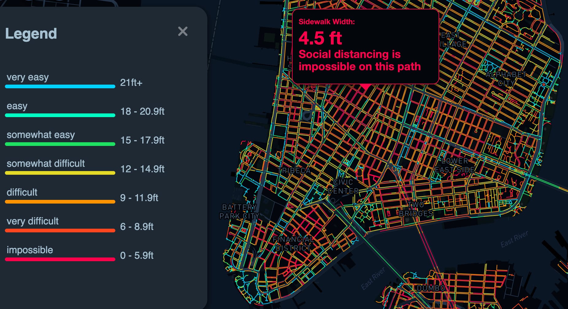
Keep Your Distance
Ensuring daily exercise in a safe and responsible way has also proven a major problem, even if it is just walking down the block. Thanks to Sidewalk Widths NYC, an amazing project by Meli Harvey, we can see how many of New York’s sidewalks are unfit for social distancing. Meli also details how she sourced the data and created the interactive map via her GitHub page.
Latest Cases, Deaths and Vaccines
Despite more than half a billion vaccines already administered, the majority of them have been delivered to developed nations across Europe and North America. As the pandemic and the inequalities it’s yielded roll on, we won’t even try to end on a positive note. Instead, we’ll leave you with the most comprehensive Covid-19 tracker we’ve found, courtesy of our friends at the Financial Times.

Stay safe, stay informed and be sure to check out all of the datasets we’ve put together! And see you tomorrow for Inside The Middle East! 🌍